
Robohub.org
Designing Jibo: Subtracting the obvious and adding the meaningful
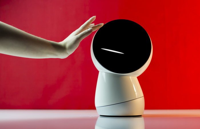
What is a social robot supposed to look like? We have asked ourselves this question many times during the last year. HUGE design was fortunate enough to be partnered with the Jibo team and tasked with creating the industrial design/look and feel for Jibo. At first, it seemed that our lack of experience designing anything remotely close to a robot might be a problem. We quickly learned however that this product needed to be unlike any existing robot, and a fresh industrial design was going to be a crucial part in defining this new socially charged experience for users.
The idea of robots being a part of our daily lives is a controversial topic to say the least. It seems everyone you talk to has a strong opinion about the issue as well as an equally vivid image in their head of what a robot looks like. Cliché robot visuals are everywhere in our culture and much of it heavy-handed and unflattering. Popular images conjure a complicated machine with poorly simulated human-like parts mixed with exposed joints, sensors and lights.
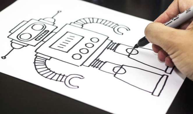
Robots have looked the way they do for a good reason. Most of these machines are a collection of motors/sensors/chips/joints that strive to mimic the movements/appearance of lifelike beings. The overtly mechanical look is driven by physical necessity, allowing these machines to do real work in a very task-oriented manner.
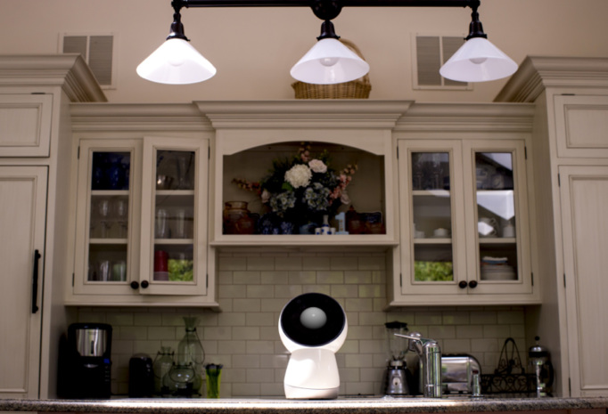
A social robot is a very different machine however. The vision that Cynthia and the Jibo team laid out to us almost a year ago painted the picture of a socially connected, intelligent home companion. Its primary skill would be its ability to emotional connect with its user and become a helpful extension of the family. Jibo would have no need to zip around the house on 2 wheels or reach over and pour you a glass of water. Instead, its movements, expressions and communication all needed to be focused directly on the user in a subtle and pleasing way. This robot’s primary mechanical task was to make you smile J.
Every design project has unique challenges and this one was certainly no exception. How do we erase the visual constructs of what a robot is supposed to look like and focus this new experience? What qualities will make this little machine deliver on the promise in sophisticated, visually bold way? John Maeda, renowned graphic designer and author of The Laws of Simplicity, famously said that the key to creating harmony between object and user arises when you “subtract the obvious and add the meaningful”. This quote summarizes our fundamental design approach with Jibo from early concepts to final product.
Subtract the obvious:
Given the primary task of connecting emotionally and re-defining social intelligence, decisions over eliminating or hiding traditional robot visual elements proved crucial to defining the look of Jibo. Some of these decisions were easy. The Jibo team envisioned a desktop companion freed from the need to complete mechanical tasks, so there was no need for arms and legs. Looking deeper at the elements of a robot, the remaining decisions of what could be eliminated were much smaller, subtle but equally important.
Jibo needed a head, but what level of detail was necessary to convey and connect with users? Working closely with the Jibo team we explored a range of head proportions and played with the level of detail needed. We all agreed we didn’t want to create anything that resembled a toy so any character-driven detail needed to be treated with abstract simplicity. Eliminating as much unnecessary detail in the face and head without taking away the visual ‘character’ necessary to connect with users was a crucial and delicate balance. Through this elimination process, we discovered that actually very little overt facial detailing is needed.
The simplification exercise then moved from the aesthetic features we could safely subtract to the more complicated issue of functional elements we wanted to hide. We certainly didn’t want a complicated mess of sensors, visible cameras and body segments to detract from the bold simplicity of Jibo. This was a heavily collaboration working closely with the extended Jibo team of software, electrical and mechanical engineers. For this effort our previous design experience working on laptops, tiny wearables and countless high tech gadgets was key to understanding where the opportunities to reduce complexity laid.
Add the meaningful:
Understanding the core elements that will make the physical Jibo resonate in a ‘socially connected’ way was equally important to the simplification of form and details. The Jibo team had established a few basic elements that would be key to this emotional connection in the hardware: a friendly silhouette activated by an expressive movement that is directly linked to an intelligent UI ‘face’ and likeable voice.
The design exploration of form and movement were closely linked and needed to be explored together to define the silhouette. Fardad Faridi, Jibo’s talented in-house animator, introduced us to the basics of character expression in animation and shared examples of basic forms that can deliver the necessary ‘line of action’ of thoughtful poses. These movements are crucial to reinforcing the emotions and interaction conveyed through Jibo’s face and voice.

A variety of form + movement architectures were explored but the design that emerged was based on earlier work from the Jibo team in Boston. The architecture sub-divided a very simple cylindrical vertical body into a series of angled/rotating sections. By controlling the movement of each section independently Jibo was able to quickly snap into a variety of expressive poses and appear to magically dance in a pleasing way. The most impressive aspect of this architecture was its inherent simplicity. The traditional pivoting joints seen on most other robotic mechanisms would have been overkill and far more visually complicated. More importantly, the cylindrical nature of the mechanism meant that the eventual form could take on a very elemental geometric quality: an abstracted character composed of a simple cylindrical torso and pure spherical head.
The design of Jibo’s face was probably the most difficult part to get right. Since the user experience would rely heavily on software driven apps and programs we all agreed his face would have to have a display somewhere on it. As discussed above, the subtraction of elements played an important role here but eliminating the display was not an option. The screen UI (working in concert with the voice and movement) would be integral in creating the facial character of Jibo while also providing necessary supporting visual communication. Luckily, the desire for impactful graphics (that can be easily seen from across the room) aligned with the desire of a large-headed, friendly character silhouette. It was crucial that users not focus on the technology inside Jibo. Hiding the display component behind the face was a seemingly small detail that has a huge psychological impact on how users react to their little companion.
Completing the vision:
In the end, the details make the design. Eliminating as many unnecessary details as possible and celebrating those few remaining with a subtle sophistication was key to the refinement of the physical Jibo. The boldly simple form silhouette made up of pure geometric shapes is accented with subtle precision engineering details and sophisticated surface transitions to express the qualities of a truly premium and intelligent device. Playful elements (such as the friendly proportions, expressive movement, high-touch surfaces of the body and the borderless face) work together to build the approachable human-like quality that other smart devices lack. The combination of these contrasted elements creates a bit of mystery around the intelligence hidden inside and creates an own-able visual icon for the first social robot. We are excited to be able to introduce Jibo to the public.
tags: human-robot interaction, Jibo, robot design, social robotics


